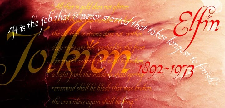
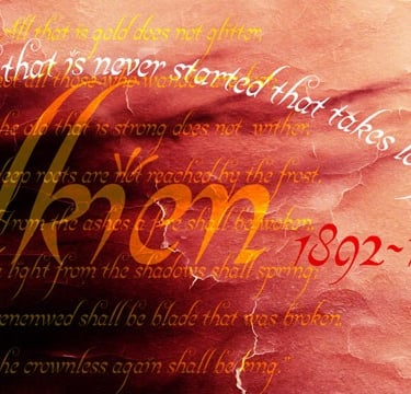
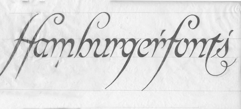
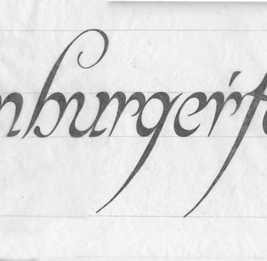
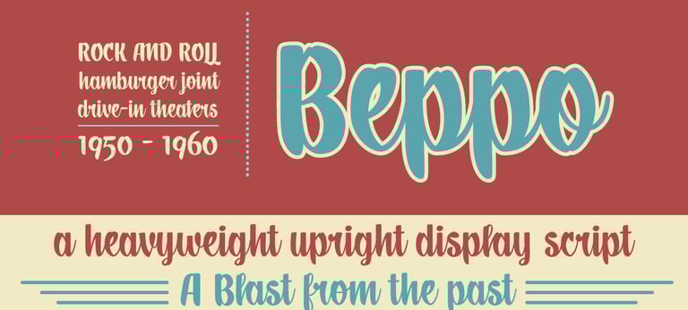
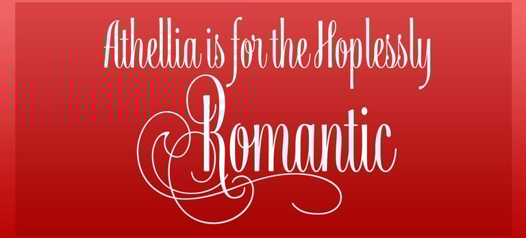
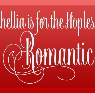
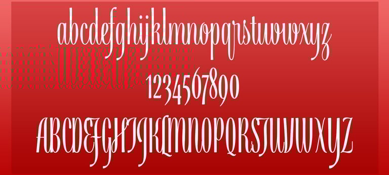
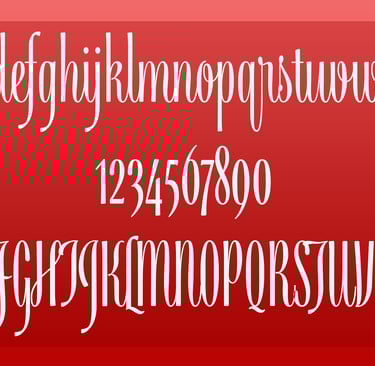
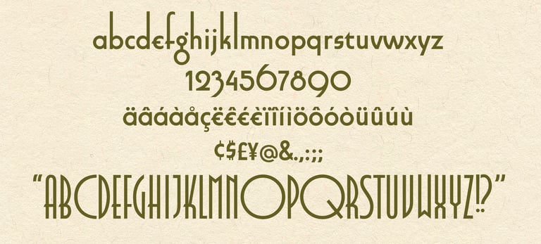
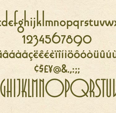
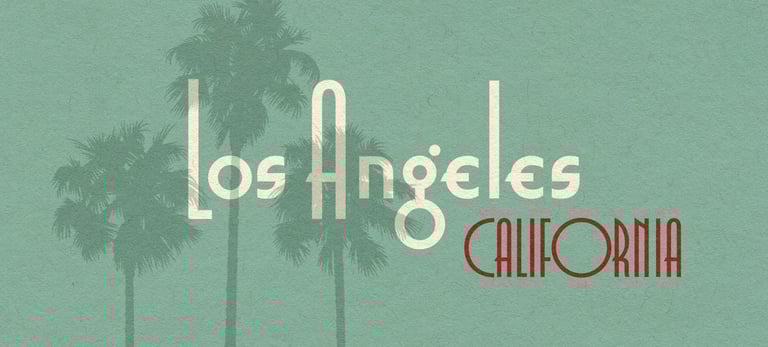
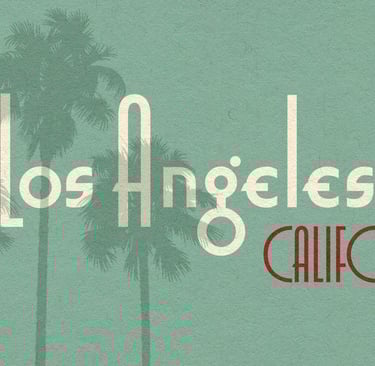
Font Design

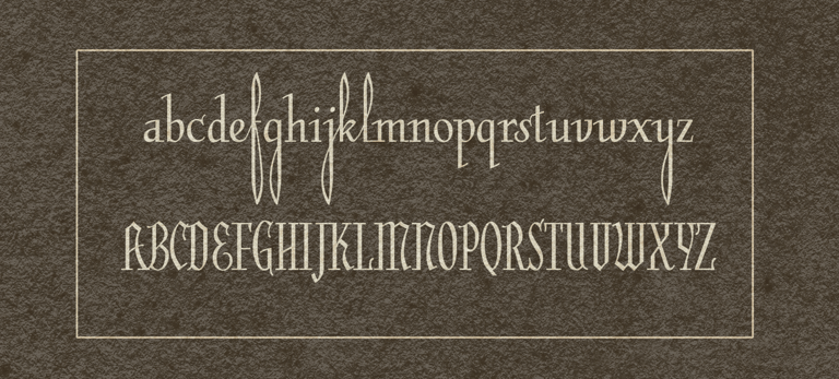
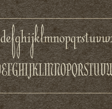
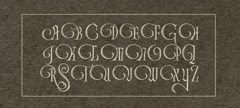
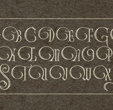
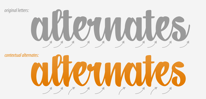
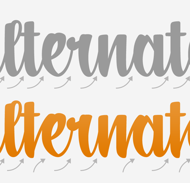
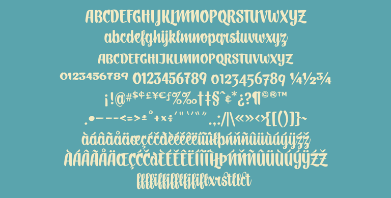
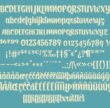
People often say they would like to watch me design and create a font, to which I politely reply, "No you don't. It's a glacial process." Font design, unlike logo design, must consider the spacing between each character and every other character. There are special pairs to consider, and ligatures to create. Some letter combinations between Caps and lowercase can be troublesome. Trust me, you don't what to watch; it would bore you to death

Elfin

2000 My first font child under the direction of my dear friend and colleague, the late Leah Hoffmitz. Elfin captures the flavor of J.R. Tolkien's fanciful Elvish font into a Latin alphabet that's legible to us. What stands out are the very high and low ascenders and descenders. The jots are little sprays. Many letters connect at the X-height.

Below are the first tight pencil renderings of the basic letterforms.

Miss Saylor

2023 Inspired by an empty box of chocolates found in the basement of my 101 year old Aunt Inga. The letter forms were loaded with cultural baggage from the 1940's. They had a voice but it was limited. I needed to give it a full volume not just in memory of my dear Aunt, but because it was so luxuriously exotic.

Below is the full character set with Diacritics for most European languages are included.

Miss Saylor's optional Swash Capitals

Beppo

2010 Inspired by hand painted lettering on the walls of a Bucca de Beppo restaurant in Pasadena, California. With help from Jeff Rubow, we fleshed this font out to a full course meal.

Contextual alternates allow for variable glyphs depending on the glph neighbors.

Below are some contextual alternates. Notice how the connections vary depending on the character neighbors.

Athellia Script

2018 An upright condensed formal script. Athellia is right at home on packaging, labels, Menus, Headlines, invitations, and title design. Scripts must consider how each character joins each other. This adds another layer complexity but the result is visual music to the eye.

Athellia has an almost hypnotic rhythm in the letterforms. It's one of the few condensed scripts.

Smart Deco

2022 If you’re looking for fonts reminiscent of the Art Deco design movement and the era of 1920-30s, here it is. Perfect circles and severe geometry. Smrt Deco has it all.

The lowercase 'g' steals the show. Smart Deco exploits the extremes between character widths